Shop Online for the fabulous products I use

Showing posts with label travel. Show all posts

Friday, July 9, 2010

Majestic Blue / Bo Bunny 9 Square layout


Okay... I had fun on both of these... and let me know if I am overdoing the "squares" but as I explained to Beth, linear works for me. And being a paper addict, I could showcase some different textures here that blend in well with the ocean shots. The bleached wood with the surfboard just does it for me!
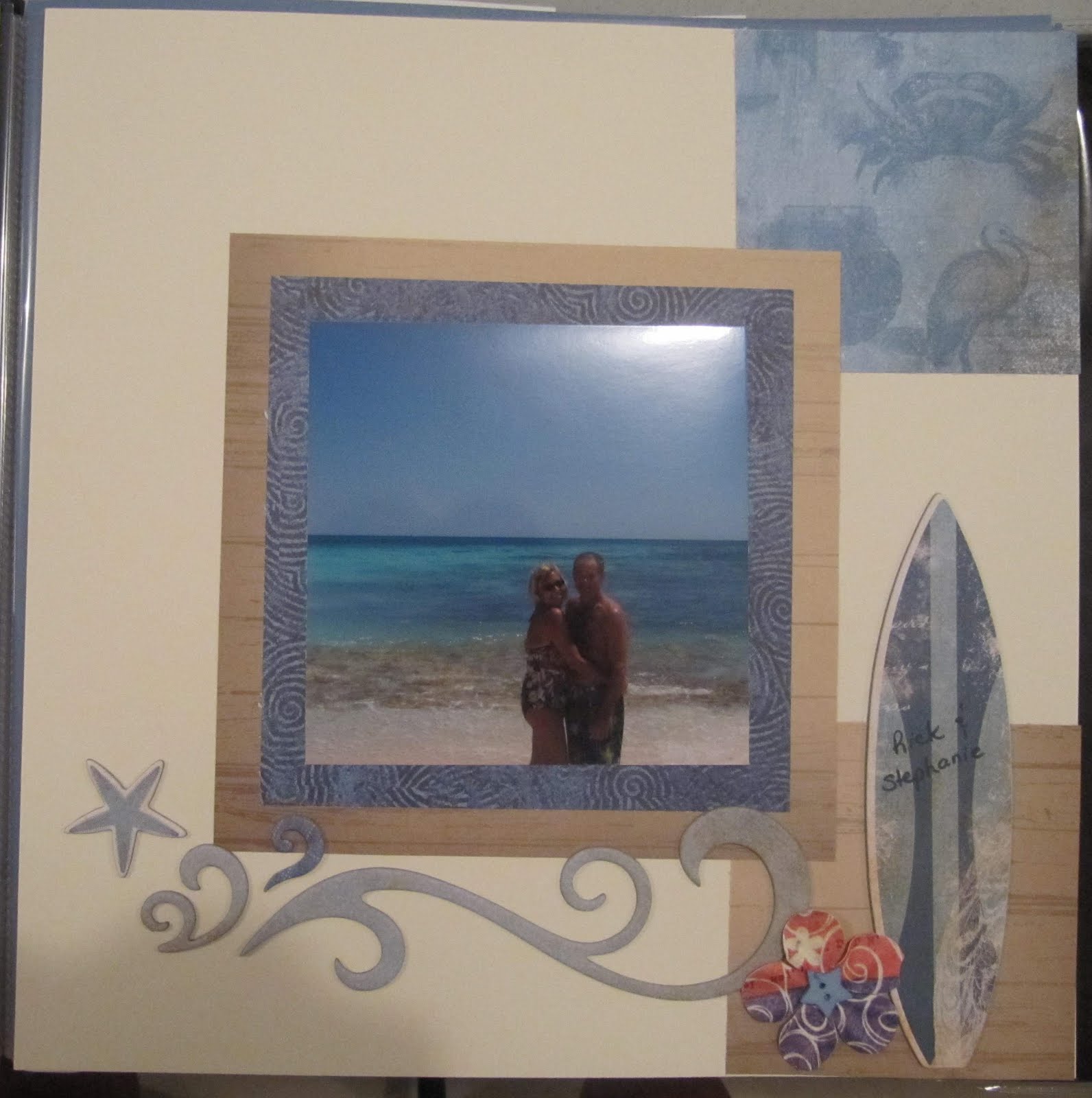
The photos again are from the Mayan Riviera , showing the beautiful coral beach. Our beach was almost overrun by coral. By saying almost, I hesitate to condemn it completely. Coral has its pluses and minuses... it is amazing to look at, and attracts gorgeous fish which are wonderful to view as you snorkel, but it is tricky to walk in on when it is close to the shore. Other than that, our resort was perfect in every way. I had more difficulty than Rick, but am having a total hip replacement August 16 that should eliminate my mobility issues the next time we take a resort vacation!
The first page is almost collage like, and was inspired by the Splendor layout by Close to my Heart. I am liking leaving some open white space too.
Materials:
Close to my Heart Majestic Blue papers
Bo Bunny chipboard and papers
Hero Arts paper flowers
Close to my Heart craft buttons and Journey Journalling Spots

Wednesday, July 7, 2010

Florabunda


Florabunda is a type of rose with many blooms... but to me, here, it means Floral Abundance.
Our resort was very well maintained and exquisitely landscaped.
I love the way palm fronds move , glisten in the light, and wave in the night. We had some spectacular giant ones in Mexico right outside our hotel room balcony . The colours were surreal: the bright orange and blue painted buildings were lit up at night to contrast with the pink and green foliage.
Beth joined me tonight and inspired this layout with a plan she had downloaded from the internet and printed off. Coloured resist Chipboard is from Close to My Heart . I also tried my new scallop punch that I bought at Lasting Impressions.

Friday, July 24, 2009

Adios Dominican


Awe.... It kind of makes me tear up just to see the 3 of us saying goodbye at the end of our trip... it may be a while before the 3 of us can splurge and do this again... I sure hope not! Chloe is off to college in the fall. I hope my kids remember this trip with fond memories !


I used a buttercup cardstock circle to envelope the photo with the clear overlay . I wanted a yellow sunset ... at the end of our book. I knew I would add some swirls . The adios tag was a last minute thought... backing it with circles from Emporium is brilliant because by cutting around the circles I got a scallop frame. I added some off white cardstock backing to show the details on the top of the overlay because Peggy told me they were lost on the yellow. Mind you , Peggy just had a cataract operation when she saw the plan for this layout ... lol that just occurred to me.


other ctmh elements: Moon Doggie tropical blue hibiscus print, cocoa diecut circles, oxford colour ready alphabet, journey journalling spots, chocolate rub ons (family, together, happy, smile)

The final Dominican posts....


Oh I am so pleased with how my last 3 pages turned out... I am going back through the entire album at this point to add, tweak, rewrite some of the journalling, but the Dominican 09 album is finished. (March.... July... 5 months?) You know what, I am not in a race to finish "events". My goal is to choose a special event to scrap... not every photo I take this year is going to be scrapped by any means. This trip, Coltons 16 birthday are done. Chloe's pre prom party and birthday are next. Some travel this summer and my 50th birthday will be included for sure this year , and as always, Christmas. No stress... just fun, planning, saving new ideas to try... I still like scrapping very much.

I used buttercup, cocoa, and Moon Doggie papers for the basis of these 2 pages. I used the large cocoa diecut frame to trace and create the smaller buttercup frame on the second page so that the border motif would tie together on both pages. Orange was my "pop out" colour, because of Connor's shirt. I think orange and blue are a neat combo. I found the Basic Grey pattern chipboard "matched" extremely well with CTMH papers. I am also loving those library card tags for handwritten journalling.

The photos show 11 of us friends and family at Golden Village Playa Dorada Dominican Republic . The resort is geared towards kids and families, and we enjoyed the wave pool and water slide as well as the ocean , snacks and drinks at the pool , together.

Thursday, July 2, 2009

Dominican title page


Every book should have a title page. This album is dedicated to my two teens . Such fleeting months before they become adults and move on with their own lives! I chose a picture of Colton and Chloe on our first night out to dinner and some beautiful tropical leaves from the Moon Doggie CTMH papers. I used colour ready alphabets , which I coloured in Spring Iris marker to give a soft look . I added a large floral chipboard piece from Basic Grey and a few rub ons in a soft celery green by the title.


I have always like greens and blues very much.
There is a song by James Taylor that I used to sing to Colton as his lullaby when he was a baby. It is called Sweet Baby James. It is fitting because "James" is my children's last name .

Good night you moon light ladies

Rockabye sweet baby James

Deep greens and blues are the colours I choose

Wont you let me go down in my dreams

And rockabye sweet baby James

Friday, June 19, 2009

Under Water


The title for this layout came to me after I made up the subtitles: seascapes and rainstorm.


Thus, Underwater Seascapes and Underwater Rainstorm. (in the latter it felt like we were under a lot of water) I used colours to reflect the greens and grey blues of the ocean. The Dominican coastline was really interesting, in that many villages were built on jagged cliffs. And the houses were just a level up from shacks so seeing them appear on the rugged rocks was astounding.


Normally I love snorkelling but this day was a cool one, and I was worried about my daughter being seasick the entire time. The kids took pictures of the fish with an underwater camera but they were not as bright without sunlight in the water.


In the Rain layout, I wanted to convey with photos the amount and force of the rainfall we were subjected to. You can see the big raindrops bouncing off the flooded sidewalks in the picture that shows people jogging along with towels over their heads.


And yes , we weathered it.


I copied the shape of the dark grey chipboard label on the Rain page by tracing around it and cutting it out of regular cardstock. It is kind of a Persian shape. Or would you say Arabic. I am a great believer in tying elements together over a two page layout, and also over an entire "theme" album. Certain things can be consistent, without being repetitive (boring) : the font for titles, for example, or certain colours. This album is certainly blue and green, with a mix between so far 2 CTMH paper packs, Emporium and Caprice. Moon Doggie is yet to come

Wednesday, May 7, 2008

Mexico: pages 13 14 15 16 Together in Paradise

I stamped the title with Delightful acrylix in cocoa and shaded the letters in cranberry and then outlined them with Jen's white pen (mine weren't co-operating) I am extremely happy with the result. The chipboard was stippled with cranberry. The hearts are chipboard that I covered with leftover Laid Back Stickease . The little bit of dusty blue fibre is the last of a big piece I had been hoarding with my Japanese stuff.
Live, Laugh, Love seemed appropriate... I know it is a cliche but is what we were striving for on our trip... to live to the fullest, laugh and be happy, and show our love for each other.

The dove in chipboard represents how free and peaceful we felt , one with nature and with each other . Swimming underwater does something to my head. I find it calming and invigorating at the same time. It is very quiet underwater and your entire focus goes straight into the visual and physical realm.
The quote says: one must have freedom, sunshine, and a little flower.

The blue and yellow vibrate (to take a word from my watercolour teacher Mary Abma ) with energy.


In keeping with the grass hut theme I selected raffia, coarse blue fibre, Laid Back beach paper, chipboard, and Desert Sand cardstock. I journalled in caps... I think I like it better than my lowercase printing. Someone please give me an opinion on this!

When I look back on these photos from March it already seems a long time ago... that I was brown, and free in the water of Mexico. Jen R came over last night and we worked on our stuff. I whipped up 4 layouts. I had already selected the papers and embellies. I wanted to keep the layout simple and showcase the drama of the spectacular photos of us in the underground stalactite caves. I just embellished with chipboard in keeping with my quick and easy philosophy of the night ... get 'er done!

Sunday, March 23, 2008

Sun Layout

Page 4.
Again, like many of my layouts, this one is all about colour... the cardstock that "went with" the water was the starting point for the entire layout. I tried to keep it uncluttered by too much pattern and I like the way the soft sunflower hue looks with a bit of the deeper one.

Some old Laid Back Stickease and some vintage patterned beach paper with starfish made their way into the accents. I put a single buttercup brad on a small flower through the chipboard S. Why do I enjoy these little details soooo much.
LOL

Saturday, March 22, 2008

Mexico title page

I created a title page for a 10 page album from my recent trip to the Mayan Riviera. This was my first real vacation trip away with Rick and it turned out to be fabulous. Our location was as close to paradise as you can get.
The iguanas were local residents and we ran into them on the paths to and from the hotel. Professional photographers took pictures by the pool for any of us tourists who wanted to be captured on film with exotic wildlife.

I have always loved butterflies and a tropical theme works well with them so I will work in a few more before I finish this album.

I wrapped the chipboard M in the title with raffia: finickity but effective.