I was asked by Peggy to attend the wonderful Ninabrook Designs scrapbook Saturday in London at Hillside Church.
www.ninabrookdesigns.com We had a choice of 12 four page layouts for our 3 classes, and were served a very wholesome, delicious lunch of assorted homemade sandwiches, salads, dips and sweets. Also included in our admission price were 2 extra kits, some adhesives, and make and takes. I was so impressed by Sharon and Heather and the work they did to make this day special. Peggy and I were resolved to really enjoy the day, relax, socialise, and have fun. We both did exactly that.
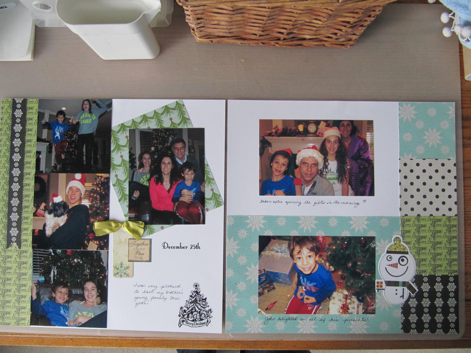
I had a particularly productive day, because I was able to add my photos to 3 of my layouts, with Noel set aside for future use.
Yay!
Here is the first of the finished layouts, with a visit to Stratford as my theme.
We did a few tears along the top and sides of the papers, and then placed contrasting
papers in behind the torn away areas to get a shabby chic effect .
I used a mix of colour and black and white photos. I really love the pennant banners with little pompoms and the hatpin embellishments we were given to add to the layout.