I particularly like the sentiment, to every thing, there is a season, a time for every purpose, under heaven, set withing a circular frame and surrounding the bursting dandelion. The invevitability of our mortality can be tolerable within the philosophy of acceptance. Our natural cycle is the same as any living creature, high or low. We alone have a higher sense of awareness. This bursting dandelion calls to mind the exquisite power of our awareness, the third eye if you will. I want to take each day as a gift, to be honored . I want to treat my body with reverence, and keep it clean and healthy out of respect and care for my children and their future children. And finally, the five banners are like family banners... they represent the past , present , future, and all those we love.
Sunday, September 22, 2013
To every thing , there is a season
I created these to send kind thoughts, a show of respect, a gentle word with some beauty and care to lift someone's spirits who is in pain, has experienced a loss, and is feeling alone.
Monday, February 11, 2013
Picasso cards
Three different
all occasion cards using Picasso prints that I purchased this summer at the
Art Gallery of Ontario.
all occasion cards using Picasso prints that I purchased this summer at the
Art Gallery of Ontario.
Sunday, February 10, 2013
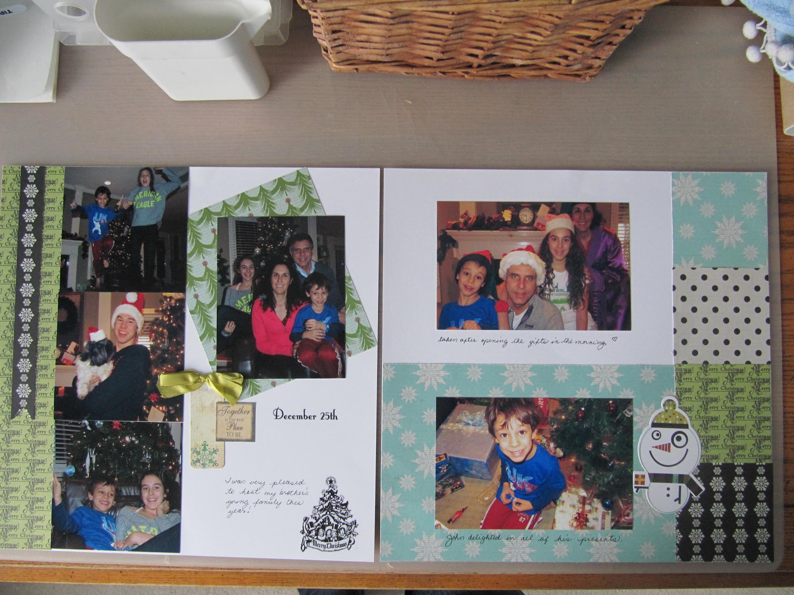
Christmas Layouts 2012
I just completed a 4 page spread on Christmas with the family, using bright happy colours : lime green, aqua blue, and some traditional deep red. This is my own design, it just evolved from the papers and photos. I try to keep a bit of each type of paper or accent on both the left and right of the layout for balance. The papers are from lily bee design. The accents are Jovial by Basic Grey and there is a little ribbon and a rubon. I think the black and white help make the colours and photos crisper. I also threw in a couple of black and white photos . I like leaving all the white "negative space" behind the featured papers and photos . I journalled in pen right on the white paper, very easy and simple to do. It was nice having my brother and sister in law from Toronto , along with their young family this year, making a big group of 8 of us for 3 days!
Thursday, November 8, 2012
BG Kayak
Colton and 2 of his buddies decided to kayak at sunset on a beautiful summer evening in August. I followed them down to the beach , deciding to take some photos . Sometimes the beach atmosphere is simply enchanting and magical... and this was one of those nights. I got a few shots of the kayak under the setting sun and enjoyed the serenity of the beach for a while.
This layout is simple enough to feature a masculine subject... something the typical scrapbook kit is unlikely to do. I left off the flowers and ribbon accents , just added the little strips of regatta penants and a denim coloured pinwheel ... perfect.
Sunday, November 4, 2012
Ninabrook Layout "Shindig"
This beautifully accented layout was created by the Ninabrook team for us to assemble.
My summer Shindig photos ( food, family, and campfire) go perfectly with the bold colours and soft background page.
Saturday, October 27, 2012
Ninabrook Layouts
I was asked by Peggy to attend the wonderful Ninabrook Designs scrapbook Saturday in London at Hillside Church. www.ninabrookdesigns.com We had a choice of 12 four page layouts for our 3 classes, and were served a very wholesome, delicious lunch of assorted homemade sandwiches, salads, dips and sweets. Also included in our admission price were 2 extra kits, some adhesives, and make and takes. I was so impressed by Sharon and Heather and the work they did to make this day special. Peggy and I were resolved to really enjoy the day, relax, socialise, and have fun. We both did exactly that.
I had a particularly productive day, because I was able to add my photos to 3 of my layouts, with Noel set aside for future use.
Yay!
Here is the first of the finished layouts, with a visit to Stratford as my theme.
We did a few tears along the top and sides of the papers, and then placed contrasting
papers in behind the torn away areas to get a shabby chic effect .
I used a mix of colour and black and white photos. I really love the pennant banners with little pompoms and the hatpin embellishments we were given to add to the layout.
I had a particularly productive day, because I was able to add my photos to 3 of my layouts, with Noel set aside for future use.
Yay!
We did a few tears along the top and sides of the papers, and then placed contrasting
papers in behind the torn away areas to get a shabby chic effect .
I used a mix of colour and black and white photos. I really love the pennant banners with little pompoms and the hatpin embellishments we were given to add to the layout.
Wednesday, October 24, 2012
Grad Layout with Flip Flaps
This layout is of my daughter Chloe's graduation ceremony from Fanshawe College.
It tells the story of her day, from getting the diploma to the reception afterward. We were lucky enough to spot the art Fanshawe Student Union had purchased from Chloe hanging in the Student Union Presidents office. I had a chance to take her picture standing with her art in the office . She was absolutely glowing with happiness. This was the first piece of art she had sold.
The flip flaps are additional 4x12 and 8x12 sections that adhere to the page protector, enabling me to enlarge the layout by an additional page.
They open and shut like door panels at the side of the layout. When designing with flip flaps, I treat them as natural divisions within the 12x12 page. In this case I split a 2012 grad print page into 2 pieces for the front, and on the inside I used extensions of the paper theme patterns in black and white to keep the flow consistent.
I also laid the photos straight across the pages in a horizontal path to keep the design clean and simple. I embellished with chipboard letters and a bit of bling.
Subscribe to:
Posts (Atom)